Relevant:
- Consumer Metrics Institute: It still feels like recession because we're now in dip #2
- More thoughts on the fake recovery
- BEA Revises 1st Quarter 2014 GDP Sharply Downward to Outright Contraction at Nearly a 1% Annual Rate
- Greek GDP contraction in H1 was worse than thought
- ISM Non-Manufacturing Index Shows Contraction
2011-04-13 — consumerindexes.com
In other words we are back to the lows of the 2010 contraction (and I bet you were told we were in a "recovery"). The commentary in this release is very enlightening as well. The link goes to the last commentary release, which is April 10; the excerpt below is from the April 12th commentary that has been emailed out and presumably will be posted on the web site soon:
We have had to update a couple of our charts as a consequence of the continued contraction in our Daily Growth Index. In its original form our "Contraction Watch" covered just a quarter's time span -- since in January 2010 we did not expect the contraction event to last much longer than that. We have now had to expand the horizontal time scale on six separate occasions, with the latest rendition reaching 540 days (or 18 months)...
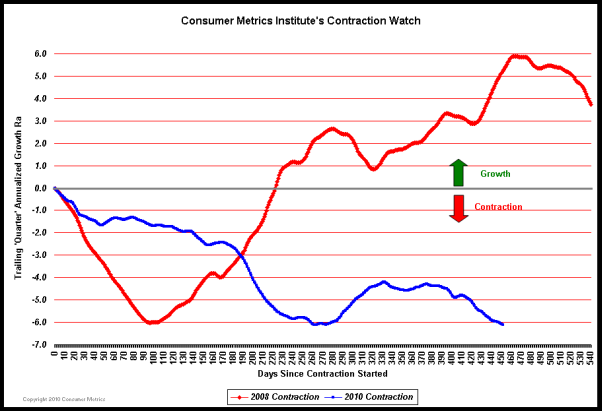
The extended nature of the contraction had also completely destroyed the logic behind another one of our charts. Our "Contraction Severity Gauge" attempted to help our members better visualize the "area under the curve" in the our Contraction Watch, and at the same time forecast as best we could the ultimate extent of the 2010 contraction. Unfortunately, our initial projection logic broke down when the duration of the contraction event substantially surpassed our experiences with the 2008 event...
In the first quarter of 2010 it was thought that a full recovery was underway, and the Federal Reserve began to contemplating "unwinding" its positions.
But by August 2010 the recovery had begun to look less robust, and another round of QE (now known as QE-2) was announced. The initial QE-2 purchases were designed to simply offset the shrinking value of the mortgage-backed securities with fresh U.S. Treasury issues (because the value of the Fed's mortgage-backed securities portfolio has shrunk by nearly 18% since May 2010 as a consequence of normal principal payments, refinancing retirements and some foreclosure activity). But by December 2010 the purchases had increased substantially beyond what was necessary keep the total portfolio balance level, bringing the total of all Federal Reserve QE purchases (QE-1 and QE-2) through early April 2011 to $2.02 trillion, with an additional $0.20 trillion planned before the end of June 2011.
It's reasonable to ask what over $2 trillion of additions to the Federal Reserve's balance sheet has accomplished:
* Since QE-1 commenced in November 2008 the Federal Reserve's Employment-Population Ratio has dropped from 61.4% to 58.5% (i.e., nearly 3% less of the population is employed). Meanwhile the official headline unemployment rate grew from 6.8% to 8.8%...
* The longer end of the Treasury's yield curve rose over 200 basis points (80%) from a bottom reached in December 2008.
It goes on like this.
source article |
permalink |
discuss |
subscribe by:
![]() |
|
![]() RSS |
email
RSS |
email 
Comments: Be the first to add a comment
add a comment | go to forum thread
Note: Comments may take a few minutes to show up on this page. If you go to the forum thread, however, you can see them immediately.